Accessible Links Re:visited
We and our clients often tend toward simple and understated style, but sometimes that simplicity doesn’t serve all audiences as well as we would like. Recently we helped develop a site for a client who wanted a clean aesthetic that was not too busy. When the site went live, they conducted an accessibility audit, and we noticed an unfortunate trend in the results: links in running text were undetectable; focus states were sometimes obscure or unclear; and some links’ purpose was confusing when spoken aloud by certain screen readers. It was a good reminder that integrating accessibility best practices and validating code will get us closer, but won’t guarantee a quality experience navigating a site with keystrokes and auditory cues.
The recipe for accessible links seems self-evident: they need to have good affordance, visually change when focused, and clearly convey to screen readers and conventional browsers alike what content the link will open or where the user will go. But we discovered during this audit that even small missteps in how we style links and write link text can mean the difference between a usable and unusable experience. Here’s what we learned.
(Example markup mentioned in this article is also in this demo page.)
Color contrast and affordance
Permalink to 'Color contrast and affordance'The WCAG 2.0 guidelines state that, at a minimum:
Color is not used as the only visual means of conveying information, indicating an action, prompting a response, or distinguishing a visual element.
When links share the same size, weight, style, and font face as surrounding text, they lack affordance, so we usually add an underline or weight shift to make links discernable to users with low vision. But links styled to stand out in a paragraph don’t always work with our client’s design, and sometimes we have to find a middle ground that balances the brand aesthetic with accessibility.
Check your contrast
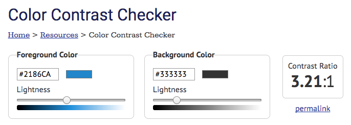
Permalink to 'Check your contrast'This is where color contrast comes in. When additional link styling is not an option, sufficient contrast between the link and text colors is essential. WCAG helpfully provides measurable criteria in the form of color contrast ratios that we can use for assessing our designs. Level AA success criteria include the following ratios:
Aside: WCAG 2.0 organizes recommendations for achieving accessibility into three levels of conformance (A, AA, and AAA), which define baseline through advanced success criteria, and each level builds upon the previous. Think of Level A as the bare minimum, and AAA as the holy grail of accessibility. We tend to shoot for Level AA compliance, which strikes a balance between the two and addresses the most prevalent concerns.
Several tools exist that will calculate the color contrast ratio for you (we Googled them for you). We like WebAIM’s Color Contrast Checker for it’s ease of use and clear feedback. Just plug in the link color for foreground, and text color for background.
We recommend using a tool like this manually instead of relying on an automated validator like WAVE, which doesn’t measure the link-against-text color contrast.
Underline subtly
Permalink to 'Underline subtly'While adequate contrast between link and text colors helps affordance, it doesn’t replace what a style shift can do — especially when you consider users who cannot detect color at all. The text-decoration property provides a nice compromise here because you can alter the underline with style and color values. For the Filament Group web site, we added a subtle light blue underline to our bold links for greater affordance:
text-decoration-line: underline;
text-decoration-style: solid;
text-decoration-color: #8cc8ff;

// or shorthand:

text-decoration: underline solid #8cc8ff;
In browsers that don’t fully support the text-decoration-color or -style properties, the underline will render as a solid line that matches the link color — as if you used the simpler text-decoration: underline.
Edit focus state, don’t remove it
Permalink to 'Edit focus state, don’t remove it'Like good affordance, a clear focus state is critical to finding your way around a web page with a screen reader or when using tabs (and is also required for Level AA compliance). All focusable elements — links, buttons, form elements — should have a noticeable visual shift when focused to provide a “you are here” reference point. (Remove the focus state from a page using your web inspector, and then tab through it and periodially hit “Enter” to see what happens.)
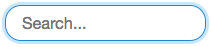
Conveniently, browsers provide a default focus state using the CSS outline property. It tends to look like a blue fuzzy neon sign around the element.
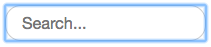
As illustrated, the outline property doesn’t listen to border radius, so the focus state looks mismatched. For the sake of aesthetics, in the past we’ve globally negated that outline rule in favor of a more subtle focus style per element — and have since learned our lesson. When you kill the outline property at the global level, it’s not possible to reinstate it on an element-by-element basis across all browsers. Once it’s gone, it’s gone, and if you don’t provide an alternate global style (like a border or box-shadow) in its place, you risk a confusing, focus-less experience.
A better solution is to keep the global outline rule, and edit the focus state per element only as needed. For our search input, we replaced the outline with a border and box-shadow that will respect the border radius, and kept the blue color because it’s most friendly to colorblind users:
As an added security measure, we recommend wrapping the replacement box-shadow focus styles in an @supports rule to ensure that they’re only applied by browsers that will render them:
@supports (box-shadow: 0 0 0 3px rgba( 180, 222, 250, .75 )) {
  input[type=text]:focus {
    outline: none;
    border-color: #2186CA;
    box-shadow: 0 0 0 3px rgba( 180, 222, 250, .75 );
  }
}
Related: Make sure hidden focusable elements are removed from the tab order using display: none or by programmatically assigning a tabindex="-1" attribute so screen readers don’t stumble upon them. Read more about creating an accessible tab/focus order in Maintaining Accessibility in a Responsive World.
Write text that reads well
Permalink to 'Write text that reads well'Screen readers speak in robotic voices in varying clarity and speed, and like your average GPS apps, occasionally mispronounce words. Text formatting can affect how a screen reader interprets the content, for better or worse.
Use punctuation
Permalink to 'Use punctuation'When a screen reader encounters inline tags like span or strong nested within block-level elements or links, it speaks their content as if it’s running text; no pauses between phrases are inferred. At least one screen reader that we know of, JAWS for Windows, will disregard white space within and between a span and its neighbors. We discovered this when using inline tags to create visual texture in marketing links. We started with this:
<div class="marketing-block">
  <a href="#">Winter is coming <span>Shop holiday gifts</span></a>
</div>
We used visual styles to separate the phrases (weight shift, text on different lines), but those things are completely ignored by screen readers that rely on text characters (spaces, punctuation) to interpret pauses between words. VoiceOver (Mac, iOS) reads it as a single sentence, “Winter is coming shop holiday gifts.” JAWS for Windows will ignore all white space in/around the span and read, “Winter is comingshop holiday gifts.”
Adding punctuation significantly improves how this link sounds. When you add a period after the first section, the text is read with a distinct pause between phrases: “Winter is coming. [pause] Shop holiday gifts”. Adding punctuation may not work visually, so you can hide it in a way that preserves it for screen readers. Examples on this page use a class for this named a11y-only:
<div class="marketing-block">
  <a href="#">Winter is coming<span class="a11y-only">.</span> <span>Shop holiday gifts</span></a>
</div>
We recorded VoiceOver reading this link with no punctuation, then with hidden punctuation:
A notable exception: NVDA (Windows) will read the hidden period aloud as “clickable dot,” which is not ideal. Users can edit how NVDA reads punctuation in its Preferences > Punctuation/symbol pronunciation dialog, however we recommend testing your code using NVDA’s default settings to determine if this feature affects your content’s comprehension.
Add non-breaking spaces
Permalink to 'Add non-breaking spaces'To avoid conjoined words in JAWS (i.e., “Winter is comingshop holiday gifts”), use non-breaking spaces between inline tags and their siblings:
<div class="marketing-block">
  <a href="#">Shop&nspb;<span>holiday gifts</span></a>
</div>
State the destination
Permalink to 'State the destination'Link text should say where it’s going to take you. In in the example above, you know you’ll go to the holiday gift shop. Ambiguity can creep in when we rely on other visual cues for defining a link’s purpose or destination that aren’t accessible to screen readers. For example, let’s say you have an image of a Google map followed by a link that says, “Get directions.” Now hide the map, or replace it with alt text read aloud. Where does “Get directions” go? Does it open a modal, or navigate to elsewhere on the page, or to a new page?
Include text for screen readers that eliminates any guesswork. “Open Google Maps to Get directions” is much clearer. If you need to keep the rendered text succinct, hide helper phrases for screen readers from view (we’re using a11y-only again here):
<a href="[url]"><span class="a11y-only">Open Google Maps to </span>Get directions</a>(And remember to use spaces and punctuation!)
Link block level elements with care
Permalink to 'Link block level elements with care'When HTML5 was introduced, links around block level elements became valid markup as long as you followed the rules of proper syntax and tag nesting. Unfortunately, links with multiple lines of content can sometimes be confusing for screen reader users, especially those using JAWS or other Windows-based screen readers which may treat text as separate links, or ignore it altogether. Take the following link structure, which navigates to a “new feature” page:
<a href="[url]">
<div>
  <h3>Introducing a new feature</h3>
  <p>This new feature will change your life and make everything wonderful.</p>
  <p>Learn more</p>
</div>
</a>
Linking the entire block gives mouse- and sighted keyboard users a larger hit area, but VoiceOver users hear one long run-on sentence: “Introducing a new feature this new feature will change your life and make everything wonderful. [pause] Learn more”. NVDA reads it as 3 separate links: “Introducing…”, “This new feature…”, and “Learn more”. In JAWS for Windows, content inside the div is, in a word, confusing.
That’s not to say block element links should be avoided. We just need to make sure link content is accessible and the call to action is clear. If you can change the markup structure, we recommend replacing block-level with inline elements (you can reapply block-level properties with CSS), and then follow the punctuation and spacing guidelines above to improve how the text is read aloud.
<a href="[url]">
<span>
<span class="title">Introducing a new feature</span>
<span>This new feature will change your life and make everything wonderful. </span>
<span>Learn more</span>
</span>
</a>Wait, there’s more…
Permalink to 'Wait, there’s more…'We hope you found this review as helpful as we did when going through the auditing process. Integrating the screen reader experience into development has helped us discover areas that are easy to overlook, especially when considering all the boxes that we need to check when creating a usable experience (clean design, responsiveness, performance). Stay tuned for more posts on what we’ve learned!
Want to chat about this post? Find us at @filamentgroup on Twitter. (And of course, if you’d like us to help you work through a challenge like this for your company’s site or app, get in touch!)
If you haven’t used a screen reader or observed one, try VoiceOver, which comes with every Mac or iOS device, or NVDA, the free screen reader for Windows. There are also many examples of screen readers in use on YouTube, or you can try WebAIM’s simulator.
Acknowledgment
Permalink to 'Acknowledgment'Many thanks to Reinhard Stebner for his contribution to this article and for his insights which are helping us become more adept at developing for accessibility. Inquiries for consulting services can be directed to Reinhard at LinkedIn, reinhard.stebner@gmail.com, or by phone: (571) 214-7319.