Working around a lack of element queries
April 2020 note: Hi! Just a quick note to say that this post is pretty old, and might contain outdated advice or links. We're keeping it online, but recommend that you check newer posts to see if there's a better approach.
Lately, we’ve been running into a recurring dilemma when building responsive designs. We want to build responsive layouts comprised of many modular, independent HTML components that fluidly fill any layout container we drop them into, but CSS3 media queries don’t currently offer a way to make content respond to its container’s dimensions (as opposed to the overall viewport size).
Nearly all of the layouts we’re building here at Filament Group these days, even the simplest stuff, would be easier to build using media queries that considered a component’s constraining parent element—whether it be body or htmlor a proportional column container within the page—and not the browser viewport. If element-based queries were possible, we could build breakpoints articulating how each component should appear when displayed at various widths—regardless of its surrounding containers—and our components’ styles would be more self-contained and sustainable across a site.
Unfortunately, we don’t yet have element-based CSS3 media queries, and we may not for a long time. As a result, we’ve needed to find workarounds of our own. So far, we’ve landed on varying hard-to-maintain overrides and repetitive styles to make components work within different containers each time a new template is needed.
It’d be great to find a better way.
An Example Problem
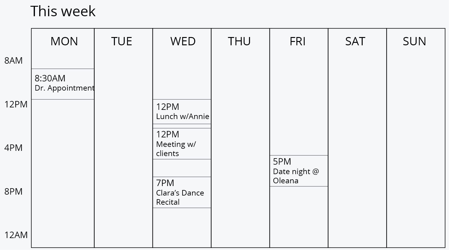
Permalink to 'An Example Problem'Let’s say we have a responsive weekly schedule component. The component has two major layout breakpoints depending on available space: at narrow widths, schedule is presented as a list, while at wider widths it displays as a calendar grid. The minimum width at which the schedule can break to the wider layout is around 32.5em (or 520px).
Fig. 1a: Narrow breakpoint design.

Fig. 1b: Wide breakpoint design.
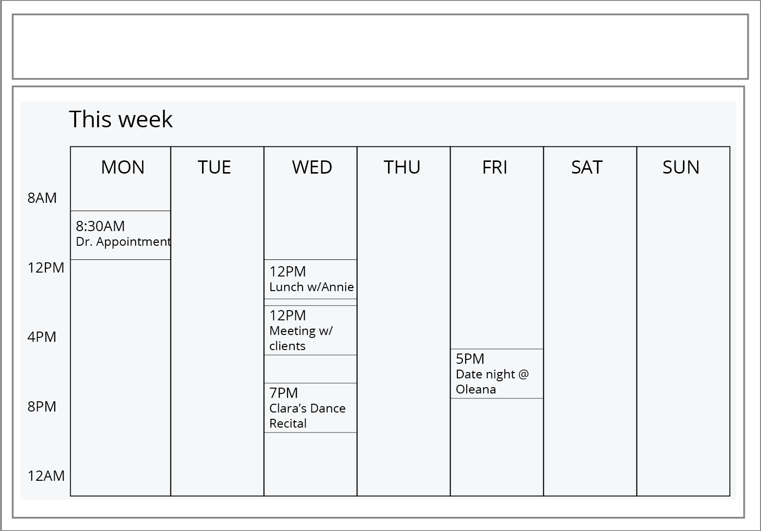
The schedule component can appear in two page templates on our hypothetical site: the schedule template and the homepage template. In each of those templates, the schedule component is contained by an element of different dimensions. On the schedule template, the schedule component is contained by a full-width .content element, and in the homepage template, the component sits within an aside element in a narrow-width column.
When placed within these templates, you can see how viewport-based media queries become problematic. Our schedule presents quite well in its primary context, the full-width schedule template (Fig. 2a):
Fig. 2a: Schedule component in its primary context: Wider breakpoint styles work great within the full-width schedule template.
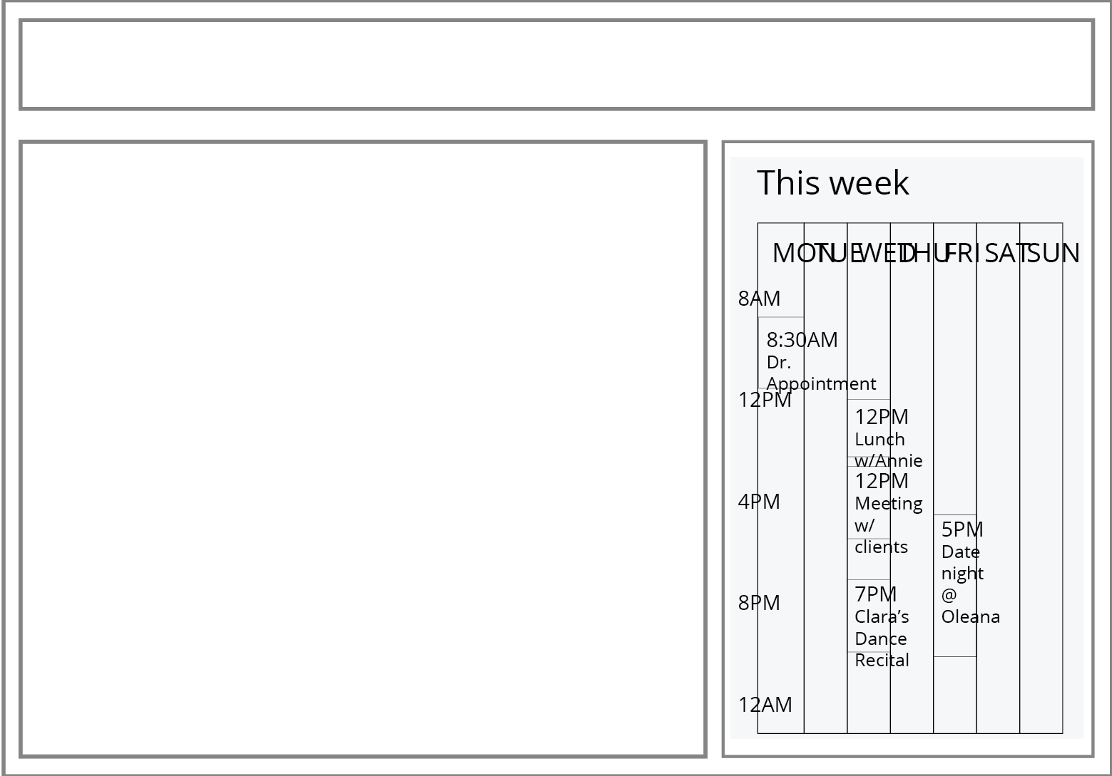
But that same markup it is completely unusable when dropped into the homepage template (Fig. 2b), where the viewport-based media queries attempt to style it for the large breakpoint presentation despite a much smaller container size:
Fig. 2b: Schedule component in its secondary homepage context: the larger viewport applies wider breakpoint styles, rendering it unusable.
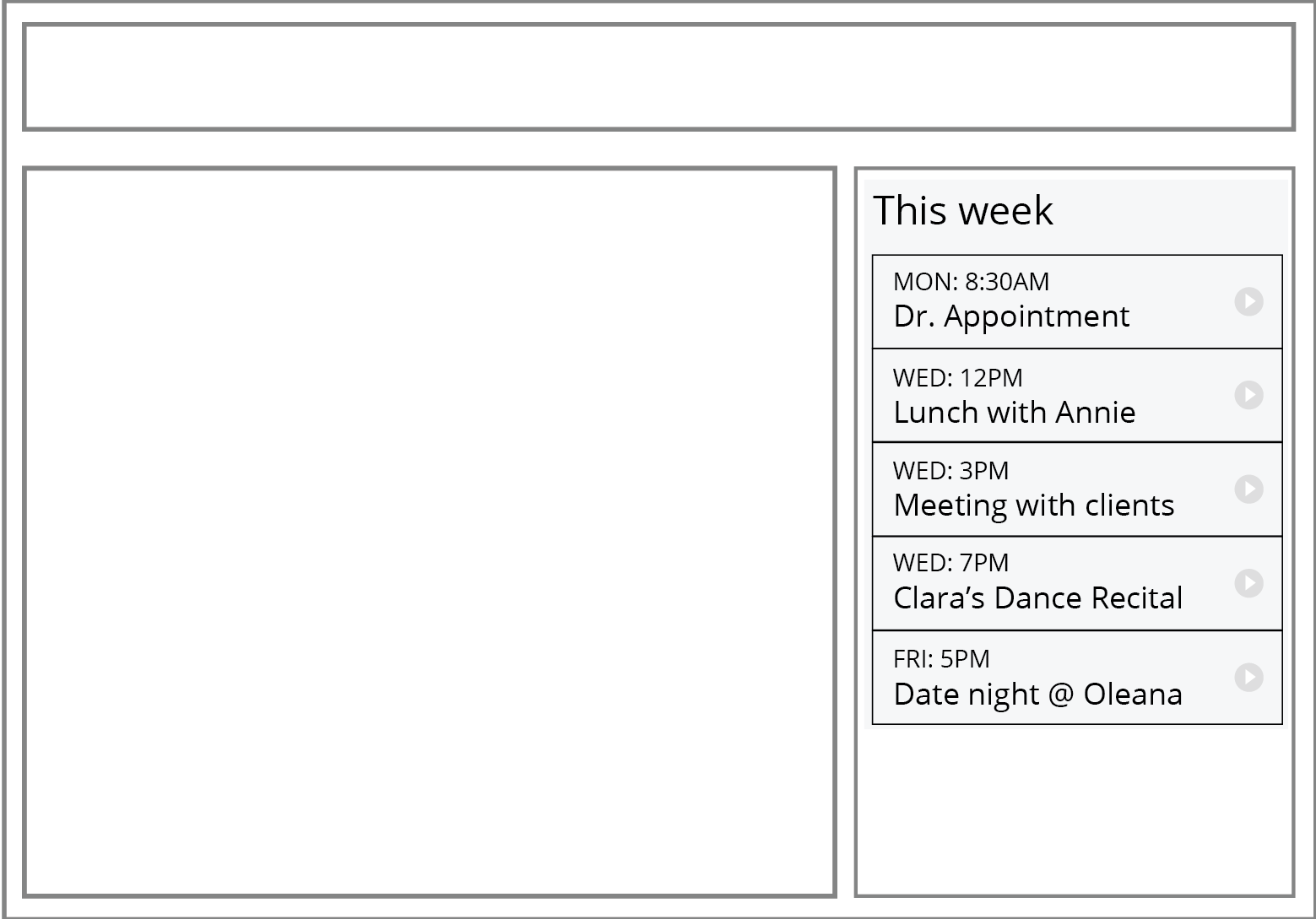
Ideally, we want our schedule component to adapt to its available containing element width, which has little to do with the viewport width. If element queries were possible, our breakpoints would allow the component to respond to its container and present itself appropriately, as shown in Fig. 3:
Fig. 3: Our Goal: the schedule component displayed in the homepage template but adopting styles appropriate to the container size (if element queries were possible).
Without element queries, it takes a lot of manual work—redundant styles, complex exception cases and workarounds—to pull this off, and the problem compounds itself depending on how dramatically a widget adapts at each of its breakpoints. For example, to make our schedule component appropriately switch from its smaller list-style view to the larger grid-style in the homepage template, its viewport-defined breakpoint would need to be closer to 90em, instead of the 35em that works for the schedule template. Perhaps a tool like SASS could help simplify this problem for us in the meanwhile.
Approach 1
Permalink to 'Approach 1'One approach to this could be pretty simple.
We could start by splitting the CSS styles for each of a the component’s breakpoints into separate CSS files (or .scss files in this case):
- schedule-sml.scss
- schedule-lrg.scss
We could then create two more CSS files that use SASS to include these 2 breakpoint files inside our respective template-based breakpoints, and reference one file or the other from our HTML templates (schedule.html or homepage.html). Here’s how those files would look (note that SASS would pre-include the files into a single compiled static CSS file):
schedule.scss (compiles to schedule.css):
@import component-sml.scss;
@media (min-width: 32.5em){ @import component-lrg.scss; }
homepage.scss (compiles to homepage.css):
@import component-sml.scss;
@media (min-width: 90em){ @import component-lrg.scss; }
In schedule.html:
<link rel="stylesheet" href="schedule.css">
In homepage.html:
<link rel="stylesheet" href="homepage.css">
This approach actually works pretty well for this particular problem. There’s a downside, though: these CSS rules cannot coexist in one template because their styles will collide with one another. It would be ideal for us if the styles could coexist in a template (in a single stylesheet), especially because we commonly have situations where a component can exist within two different HTML containers simultaneously in the same template at a single viewport size — for example, we might want to display the same component at its medium size in the body of the page content and also show it at the small size inside a modal dialog that is narrow and centered on the screen.
Approach 2
Permalink to 'Approach 2'To address this additional challenge, a second approach could be to create a SASS mixin that creates separate media queries containing the same block of layout styles, each with selectors that are prefixed to make them only apply in one container context or another. The intended output CSS for the two first breakpoints of the component could look something like this:
@media (min-width: 32.5em) {
 	.content .schedule-component {
		...styles here...
	}
}

@media (min-width: 90em) {
	aside .schedule-component {
		...styles here...
	}
}
Now, I’m no SASS expert, so I’m not sure what sort of input syntax would be needed to produce this output. I think something like this would be pretty nice to work with, though:
@include elementquery(
	{
		".content": "(min-width: 32.5em)",
		"aside":    "(min-width: 90em)"
	} ) {
	/* styles for this common layout breakpoint go here */
	.schedule-component {
		...styles here...
	}
}
That said, a brief look at the SASS documentation suggests that SASS doesn’t accept object syntax for an argument, so this syntax may not be possible.
It’s worth noting that a drawback to the compiled output of this approach may be redundancy in our CSS. That said, gzip compression might actually render that overhead null, so the transfer size would be relatively the same as if the duplication wasn’t there.
Any ideas?
Permalink to 'Any ideas?'The lack of element queries can be problematic when trying to write components that are modular and able to adapt to varying layout conditions. For now, Approach 1 above is a workable solution, but it requires that variations live in separate templates, and that doesn’t usually meet our needs.
We’d love to see a SASS mixin that allows us to use Approach 2, since it seems like an easier system to maintain across many templates and widgets. Any Savvy SASS experts out there? Also, if you have any other ideas about working around this issue (preferably ideas that do not require JavaScript), please let us know!