Introducing the new responsive-designed BostonGlobe.com
April 2020 note: Hi! Just a quick note to say that this post is pretty old, and might contain outdated advice or links. We're keeping it online, but recommend that you check newer posts to see if there's a better approach.
The Boston Globe flipped the switch today on its accessible, progressive enhancement and responsive-design based subscription news site. As front-end development leads on the project (with Ethan Marcotte at our side), we’re very honored to have been involved.
Early this morning, the team at the Boston Globe flipped the switch on an incredibly ambitious new web site, and the 139-year-old Award-winning American newspaper gained a proper home of its own on the web. As Boston locals and long-time subscribers to the paper, we’re quite proud of the Globe and what they’ve accomplished with this launch; as front-end development leads on the project, we’re honored to have been involved, and thrilled with the quality of the site in action.
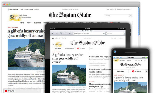
BostonGlobe.com – which should not be confused with its still-existing sister site, Boston.com – brings the Globe’s premium journalism and reporting to the web in a way that is accessible and a pleasure to use on most any device - whether that’s an old BlackBerry, an iPhone or iPad, or a desktop browser.
Better yet, they’ve managed to achieve this cross-device support with a single codebase that takes advantage of features available in the latest devices and browsers, such as touch gestures and offline browsing.
We plan to cover the technical challenges and solutions in depth on this blog in the near future. But in the meantime, we wanted to note some of the important discoveries we made about what makes a responsive design project of this magnitude possible:
- You need a client willing to make a real commitment to embracing standards, expanding their expectations about brand and user experience, and most importantly, transforming their internal work processes to incorporate new principles and methodologies. Globe publisher Chris Mayer, Editor Marty Baron, and most especially Jeff Moriarty, Miranda Mulligan and the entire Boston Globe development team were beyond exemplary in this regard.
- You need a visionary thinker who can articulate the vision of this new idea, and we had that in spades in our colleague Ethan Marcotte, the inventor and father/godfather/grandfather/chief prophet of responsive design. (If you have any interest at all in responsive design techniques and haven’t read his book on the subject, you should.)
- You need visual designers who understand and embrace the challenge, and our wishes were superceded time and again by our tireless & fearless leader Miranda Mulligan at the Globe, and the unbelievable team of Tito Bottitta, Mike Swartz and Jared Novack at Upstatement. That their visual design is gorgeous, elegant, and a true pleasure is self-evident. But we could not have arrived at such a solution were they not genuine, welcoming collaborators.
- Particularly in these relatively uncharted waters, you need highly skilled front-end developers who understand standards, progressive enhancement techniques, cutting-edge coding best practices and responsive design principles. We are so continually impressed with our own Scott Jehl, Mat Marquis, and Maggie Wachs, who make a practice of inventing fantastic, magically innovative new code techniques from thin air on a daily basis—and can also sit down and explain them so the rest of the team can understand and build on them. They are amazing.
- Finally, you need to be at the right place, at the right time, with all of the above at the ready. We’ve worked together for ten years now, and have been talking about and working toward a vision of a single code base that is accessible, and thoughtfully delivers an appropriate experience to the vast array of devices. This project has been the culmination of years of thinking and guessing and hoping, and we feel is validating many of our hopes for how the web can and should work.
To say we’re thrilled with the result is a serious understatement. We’re excited to see how the site evolves, and how the discussion about responsive design and the web does as well.