How we make RWD sites load fast as heck
April 2020 note: Hi! Just a quick note to say that this post is pretty old, and might contain outdated advice or links. We're keeping it online, but recommend that you check newer posts to see if there's a better approach.
There has been a lot of discussion about optimizing responsive layouts for performance lately, and I think that’s great. Speed broadens access and makes users happy, much like responsive design.
In the past year I’ve spent a lot of time researching page loading performance, both for our ongoing client work here at FG and for my book Responsible Responsive Design. In the process, I’ve reaffirmed my belief that we don’t need to compromise the well-known benefits of a responsive layout in order to make our sites load as fast as heck.
In this post, I’ll outline some recent observations and approaches to delivering sites for speed and broader access, and link out to various tools we are using to facilitate our approach. All of the tips mentioned in this post are implemented on this very site, and we’ve tested them heavily to ensure that they’re working as well as they can.
I’ll start with some high-level observations, then later I’ll dive into the more technical how-to. First, some general notes about page loading performance and what we aim to accomplish.
Page weight isn’t the only measure; focus on perceived performance
Permalink to 'Page weight isn’t the only measure; focus on perceived performance'When discussing how multi-device code correllates to page loading performance, one of the primary measures developers typically point to determine success is total page weight. However, we like to emphasize is that while the weight, or byte size, of our sites is increasing (and that is a valid concern – data plans are expensive!), weight doesn’t necessarily need to increase the time a user needs to wait to use a page. A page typically becomes usable much sooner than when it finishes loading. How we load assets matters just as much as how many assets we’re loading.
A more useful benchmark for evaluating page speed from the user’s perspective is the time it takes for a page to become usable. You’ll often hear developers refer to this as “perceived performance,” because it refers to the performance metric that is most easily perceived by the naked eye, and likely to be most meaningful metric to our users.
While the term may sound subjective, perceived performance is quite easy to measure, and there’s plenty we can do to improve it on any site—regardless of whether the site is responsive or not. To measure perceived performance, we need to find out how long it takes for a page to start rendering visually in the browser. Webpagetest.org is a fantastic tool tool you can use for this purpose. Just pull up Webpagetest, enter the URL of a site you’d like to test, and hit “Start Test.”

Webpagetest requests the site in a real browser and device, analyzes how it loads, and provides tons of information. Some portions of Webpagetest’s results are directly related to perceived performance, for example, “Start Render,” which you can find in the overview table below. As you can see, Filament’s responsive site begins to render between 200 and 300 milliseconds on a typical connection speed (that’s fast, by the way! :) ).
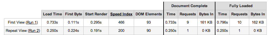
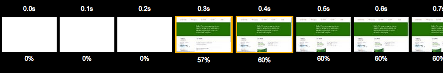
Alternatively, you can view page rendering in a video frame timeline, which is particularly handy for watching how smoothly the page loading process is carried out overall. For example, Filament’s site loads custom fonts, icons, and background images after Start Render, and you can see those assets snap into place with each keyframe after rendering begins (full timeline here ).
Rendering a complex layout this quickly requires careful considerations, so let’s look at some ways we can control that outcome.
Shortening the critical path
Permalink to 'Shortening the critical path'You might have heard the term “critical path” used to describe the time between when a page is requested and rendered. I find that to be a nice metaphor, as it makes me think of the loading process as a path between point A and point B that requires a number of steps to complete. Fortunately, many of those steps are under our control. For example, CSS and JavaScript requests can significantly increase the time it takes a page to render. That’s because by default, browsers will delay page rendering until they finish loading, parsing, and executing all of the CSS and JavaScript files referenced in the head of the page.
For example, here are some typical external file references that will block rendering while they load:
<script src="path/to/script.js"></script>
<link rel="stylesheet" href="path/to/stylesheet.css">
Ideally, we want to shorten our critical path so that it can be completed in the fewest, shortest steps possible and without any detours (read: external requests). Additionally, we may want to tell the browser that it can handle certain steps independently of rendering the page. We can instruct the browser to perform its page loading steps in one of two ways: either request files asynchronously so that they can load and execute while the page is being rendered, or include the code inline directly in our HTML page.
Going async
Permalink to 'Going async'One approach to avoiding blocking requests is to request files in an asynchronous manner so that they load and execute on their own schedule, independent of page rendering. For JavaScript files, we can do this easily in modern browsers by adding an async attribute to a script element.
<head>
  ...
  <script src="/path/to/script.js" async></script>
  ...
</head>
But… async is only supported in the latest browsers (IE 10+), and, a script element offers us no means of qualifying whether a request should be made in the first place (we typically only load our DOM framework and other scripting enhancements in browsers that support certain features, after all). For these reasons, we typically add a small bit of JavaScript to request our files asynchronously: we maintain loadJS for just this purpose. Here’s how loadJS can be used to request a script, once included in the page (I’ve abbreviated the loadJS source code):
<head>
  ...
  <script>
    // include loadJS here...
    function loadJS( src ){ ... }
    // load a file with loadJS
    loadJS( "path/to/script.js" );
  </script>
  ...
</head>
As for asynchonously requesting CSS files: HTML offers no native means of requesting a stylesheet asynchronously (Good news! This is no longer true! See our updated post on this), so we need to use a bit of JavaScript to make an asynchronous stylesheet request as well. We maintain the loadCSS project for just this purpose.
Here’s how it looks to use loadCSS (again, with loadCSS source code abbreviated):
<head>
  ...
  <script>
    // include loadCSS here...
    function loadCSS( href ){ ... }
    // load a file with loadCSS
    loadCSS( "path/to/stylesheet.css" );
  </script>
  ...
</head>
Inlining Code
Permalink to 'Inlining Code'Another way to avoid making blocking external requests is to include the contents of files you would have requested directly in the HTML document. This is known as inlining. CSS files can be inlined in an HTML document inside a style element, and JavaScript files can be inlined inside a script element.
<head>
  ...
  <script>
  /* contents of a.js go here! */
  </script>
  <style>
  /* contents of a.css go here! */
  </style>
  ...
</head>
Inlining is great in that it saves us from making slow, render-blocking requests, and it still allows us to execute code before the page is rendered (which is desirable in some cases). But inlining also has some downsides in that it prevents the browser from caching the code itself for reuse on subsequent pages, and it’s also very easy to overuse, as inline code still needs to be parsed before the page content can be rendered so you don’t want to include anything unnecessary. Basically, inlining is useful for critical portions of CSS and JS that need to be parsed before the page is rendered, but we want to use it sparingly.
Now that we have some tools for loading CSS and JS in faster ways, we need to figure out which code to include inline in the head of the page, and which to request externally.
Which code should I “inline?”
Permalink to 'Which code should I “inline?”'In some cases, blocking page rendering while CSS and JavaScript is parsed is desirable. For example, we want the browser to load all of the CSS necessary for the page to render before the browser starts rendering it, because if we don’t, users will see a flash of unstyled content. Also, some JavaScript works best if it executes before a page renders as well, such as an HTML5 shim that enables older versions of IE to recognize new HTML elements as it parses them (feature tests and class additions are other examples).
So generally, a lot of our CSS and JS can be safely requested asynchronously, but usually not all of it. The “critical” parts that need to be present for rendering the initial page should be inlined in our HTML. The trick is figuring out how to divide it up between inline and async.
Shooting for 14
Permalink to 'Shooting for 14'In this scenario, it’s helpful to consider some basic information about how our code is transferred during page load. Every request to the remote server takes time, and each response from the server carries a limited quantity of data. In order to aim for the fastest page loading time, we want to try to fit the code required for rendering the top portion of a given page in the first response from the server, which happens to carry around 14kb of compressed code (it’s often less, but 14’s a solid goal to shoot for).
Basically, we want fit the HTML, CSS, and JavaScript that’s necessary for Start Render in that first 14kb round trip.
Determining the inline CSS
Permalink to 'Determining the inline CSS'Let’s say your entire stylesheet can be inlined in the head of a page while keeping the overall weight of that page under 14kb (gzip). In that case, you’ve got it pretty easy. You might choose to just inline that entire stylesheet and call it a day because your site is going to be incredibly fast without further work.
Of course, most sites’s main stylesheet alone weighs more than 14kb, and if that’s true for your site, you’ll likely need to abstract a “critical” portion of your site’s CSS and include only that part inline, requesting the rest of it asynchronously. There are a bunch of new tools in active development to handle this task, one of which we maintain and use on this very site, called Grunt Critical CSS.
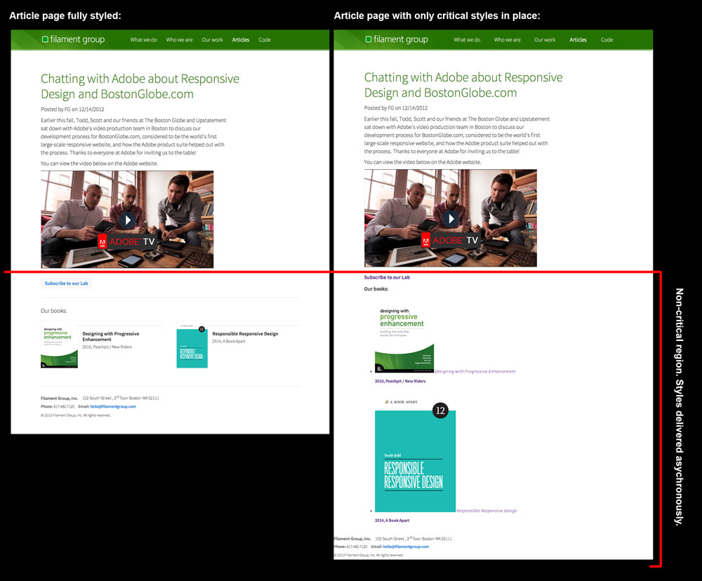
Our Grunt Critical CSS task will open a page in a browser from the command line, set the window width to a specified width and height (default is 1200 x 900), and analyze which styles are applied to elements that fall within the visible portion of that viewport. It then writes those styles to a file that you can include inline in any page. The graphic below visualizes the region of the page we’re concerned with for gathering critical CSS—the styles necessary for rendering the top of the page are generated by the Critical CSS task and inlined in the head of the page (the rest of the CSS can load asynchronously). As you can see in the image on the right, the elements below our critical region are unstyled when the page is initially served (click image to view enlarged).
To use the task, you’ll need a basic understanding of running Grunt tasks, which you can find on the Grunt project site. Then, it’s just some basic configuration to set up. For this site, we run the task on each main template of the site (home, about, portfolio, etc.) to generate a critical CSS file specially catered to that template. Then we inline that CSS in that template on the server-side. Here’s a bit of that configuration:
criticalcss: {
  home: {
    options:  {
      outputfile : 'css/critical/critical-home.css',
      filename : 'all.css',
      url : 'http://fgwebsite.local'
  }
  },
  services: {
    options:  {
      outputfile : 'css/critical/critical-services.css',
      filename : 'all.css',
      url : 'http://fgwebsite.local/services/'
    }
  },
  about: {
  ...
In that configuration above, we specify all.css as our full stylesheet that should be analyzed by the task. During our page loading process, this full stylesheet is the one we will request asynchronously using loadCSS.
Note: you should also check out the Critical Node.js task by Addy Osmani, which was released during the production of this article. Also see Penthouse by Jonas Ohlsson.
Determining the inline JS
Permalink to 'Determining the inline JS'For JavaScript, we typically separate our critical and non-critical code by manually creating separate builds of files. We aim to make the JavaScript we include in the head of the page as concise as possible, so it usually only contains some feature tests and some scripting to facilitate the loading of additional assets. The rest of our JavaScript, which typically includes a DOM Framework like jQuery and various user interface widgets, is all concatenated into a single “enhanced” JavaScript file that we will load asynchronously in browsers deemed qualified.
Since this is a process we repeat on every project these days, we’ve created an updated version of our Enhance project to serve as a boilerplate for the JavaScript that we typically include in the head of our page. As of version 2, Enhance.js is no longer meant to be a library or framework, but rather an editable file. It is small, delete-key-friendly, and meant to be edited to the needs of your project. By default, the enhance.js file includes our other scripts like loadJS and loadCSS, as well as a little logic to make use of those scripts in qualified manner.
We use Enhance.js to run brief browser diagnostics before deciding whether to enhance a basic, but already-functional page further by adding classes and requesting additional scripts and stylesheets. If you happen to recall my 2008 article Test-Driven Progressive Enhancement, or if you aren’t old like me and have heard the modern term “cutting the mustard,” coined by Tom Maslen at the BBC, this process may sound familiar to you.
By default, Enhance.js is set up to follow these steps:
- Define some variables and functions for loading assets and accessing information about the browser and markup
- Run one or more tests to see if a browser is qualified to load and render additional enhancements
- A) If it’s not qualified, exit early and do nothing more, or B) If it is qualified, proceed on to load additional assets, add classes to the document, etc.
In code, that qualification test (or “cut the mustard” test) often looks something like this snippet, which tests if a the querySelector and addEventListener features are supported (the particular feature tests we use vary from project to project):
if( "querySelector" in document &&
    document.addEventListener ){
    // qualified! enhance the experience
…after which, we typically add a class of .enhanced to the html element for qualified CSS enhancements, and load our enhanced JavaScript file.
Pulling it all together
Permalink to 'Pulling it all together'With these approaches in mind, we can circle back now and take a look at how we configure the head of our pages. On this site (filamentgroup.com), we start with some meta tags that define the paths to our CSS and JS files (these are handy when loading those files from the JS), and follow those with our inline JavaScript and CSS explained above. Lastly, we like to reference our full stylesheet via an ordinary link within a noscript element to ensure it’ll be requested in non-JS environments. Here’s a simplified example of the configuration used on this site:
<head> ...
   <!-- URL for full CSS file -->
   <meta name="css-all" content="/path/to/all.css">
   <!-- URL for enhanced JS file -->
   <meta name="js-enhancements" content="/path/to/enhanced.js">
   <script>
     <% include "/path/to/initial.js" %>
   </script>
   <style>
     <% include "/path/to/template-xyz-critical.css" %>
  </style> ...
  <noscript>
    <link rel="stylesheet" href="path/to/all.css">
  </noscript>
</head>
With our critical CSS and JS inline in the head of our page, we can asynchronously load the rest of our assets and allow our page to render as soon as possible in a qualified manner.
Taking advantage of cache
Permalink to 'Taking advantage of cache'The configuration above facilitates a very fast initial page load, but there’s still plenty we can do to improve our performance, particularly on subsequent page visits.
Here’s one example. On the first time a browser visits this site we set a cookie after asynchronously requesting certain files (such as our site’s full CSS file) to specify that now that the files have been requested, and are likely to be cached by the browser. Then, on subsequent visits to our site, our server-side code checks if that cookie is present and if so, it avoids including any inline CSS and instead just references the full CSS externally with an ordinary link element. This seems to make the page load a little more cleanly on return visits. We do the same for our fonts and icons CSS files as well.
You can read more about this approach in the Enhance project readme.
Comparing the benefits
Permalink to 'Comparing the benefits'Just for comparison sake, I made an example version of our homepage that loads CSS and JavaScript assets in a traditional (blocking) manner and ran it through Page Speed Insights and WebPageTest. Our homepage has a fairly simple layout, so I didn’t expect the results to be terribly dramatic, but I found that the results clearly confirm the performance impact of these recommendations, especially when browsing conditions aren’t ideal.
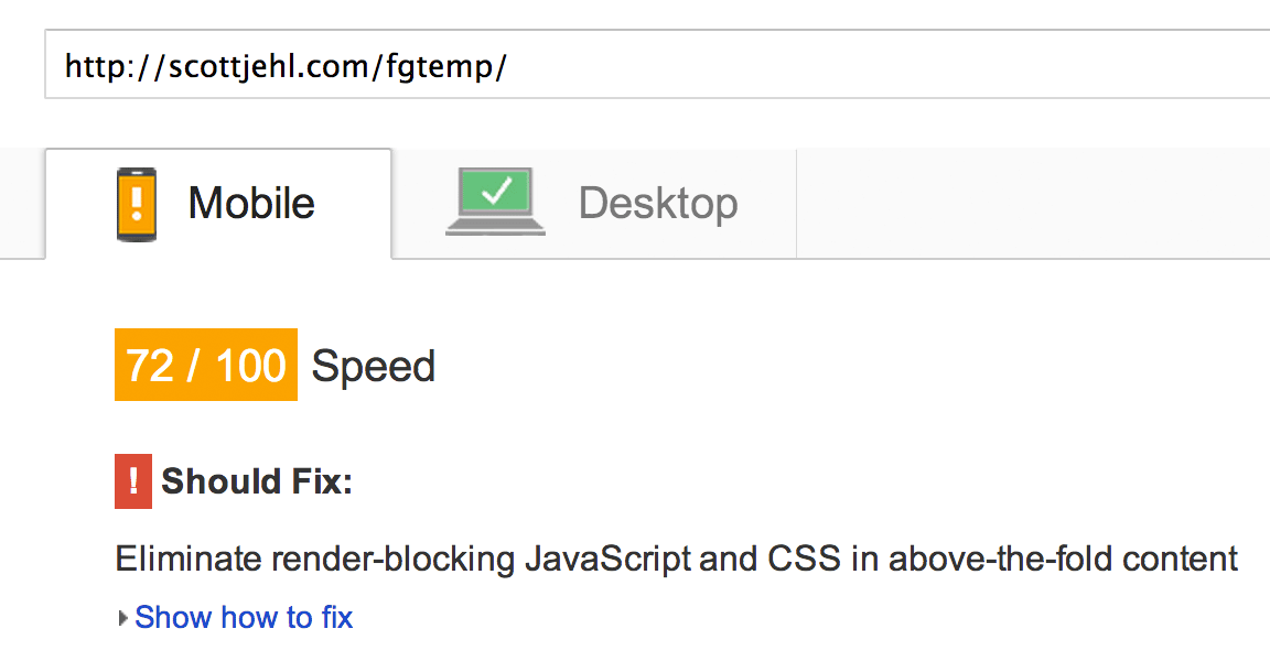
First, while our actual site currently scores a 100/100 on Page Speed Insights, the “bad” example site scores a 72/100 for “mobile” screen sizes, and an 88/100 for larger “desktop” sizes.
Our Page Speed Insights score without these optimizations:
Further, on WebPageTest, our example site’s scores are all over the map. The average Start Render time on a fast connection speed increased to 900ms, which is still pretty good, though much slower than our live site’s 295ms average. Of course, that’s assuming everything is working well; what’s more worrisome about this approach is what happens when network connectivity is inconsistent or slow. For example, in one test run of the example site, some assets took more than a second to load and the page wasn’t rendered until after 2.5 seconds!
Our WebPageTest score without these optimizations:
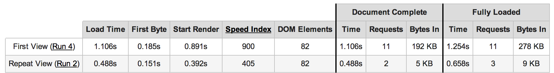
Keep in mind that these tests were performed with WebPageTest’s default stable 5mbps cable connection speed, so it’s safe to assume that the impact of blocking requests would be much, much more noticeable on a common cell connection speed like 3G.
The web is a hostile, unpredictable medium where things can and frequently do go wrong. It’s clear that anything we can do to streamline that critical page loading path can make a huge difference for our users.
Further reading
Permalink to 'Further reading'While this post highlights our approach to loading CSS and JavaScript files, there are plenty of other tools we use to load our responsive sites in faster, more fault-tolerant ways. Our SouthStreet project readme highlights the main tools we use for asset-loading tasks, and while it overlaps this post in many ways, it also covers tools like Picturefill, Grunticon, AjaxInclude, and more.
Also, I’d recommend checking out these other resources and posts related to this topic:
- Addy Osmani: Detecting Critical CSS For Above-the-Fold Content With Paul Kinlan
- Comparing two ways to load non-critical CSS
- Tim Kadlec: Fast Enough
- Tim Kadlec: “RWD Is Bad for Performance” Is Good for Performance
- Tim Kadlec: Grunt-Perfbudget Webpagetest on the command-line. We use it to keep tabs on our performance every time we make commits to various client projects.
- Dave Rupert: RWD Bloat
Feedback?
Permalink to 'Feedback?'Thanks for reading along. If you have questions, you can find us on Twitter: @filamentgroup and @scottjehl