Presentation: Accessibility in a Responsive World, A11Y Days 2017
This April, I was thrilled to be given the opportunity to present at Funka’s annual Accessibility Days Conference in Stockholm. The following is a transcript and slides from my presentation, Accessibility in a Responsive World.
Good afternoon, everyone! It’s such an honor for me to be here in Stockholm at this event. Thanks so much for joining me for this technical session.
Today I’m going to talk about accessibility within the context of responsive web design.
I work for a consultancy in the US called Filament Group.
At Filament, we design & develop websites and applications for clients both large and small. And on behalf of our clients, our goal has long been to build sites that are accessible to as many people as possible.
In that aim, we’ve found that being “accessible” means many things to us, to our clients, and to users.

First, it means that a website must be able to be reached in the first place, from anywhere in the world, and quickly—particularly in slow and spotty mobile networks.

And that alone takes special care to do well.
Many aspects of web delivery are out of our control, but we can do a lot to increase the odds of a fast & useful delivery. So I like to think of performance and resilience as the earliest accessibility metrics to care about. Speed improves access. And to build resilient sites, we need to plan for failure, even expect it, and take steps to ensure our code can gracefully tolerate faults that can render a site unusable, or prevent it from rendering at all.

Building accessibly to us also means that once the code is delivered, the website should be usable and intuitive and feel appropriate to folks using any device, browser, viewport size, and assistive technology.
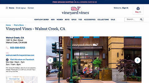
From a screen size perspective, that means designing interfaces that are fluid and contextual, to feel at home on any device, and this is something Responsive Web Design—the pairing of fluid layout & images, with CSS media queries—helps us do quite well.
It’s been amazing to watch responsive design go from a proof of concept that a small number of us used on our blogs to what’s now almost an expected quality of a website.

Of course, to truly work across all of these different screens, responsive interfaces need to be inclusive to common input modes as well. Like keyboard, touch, and mouse.
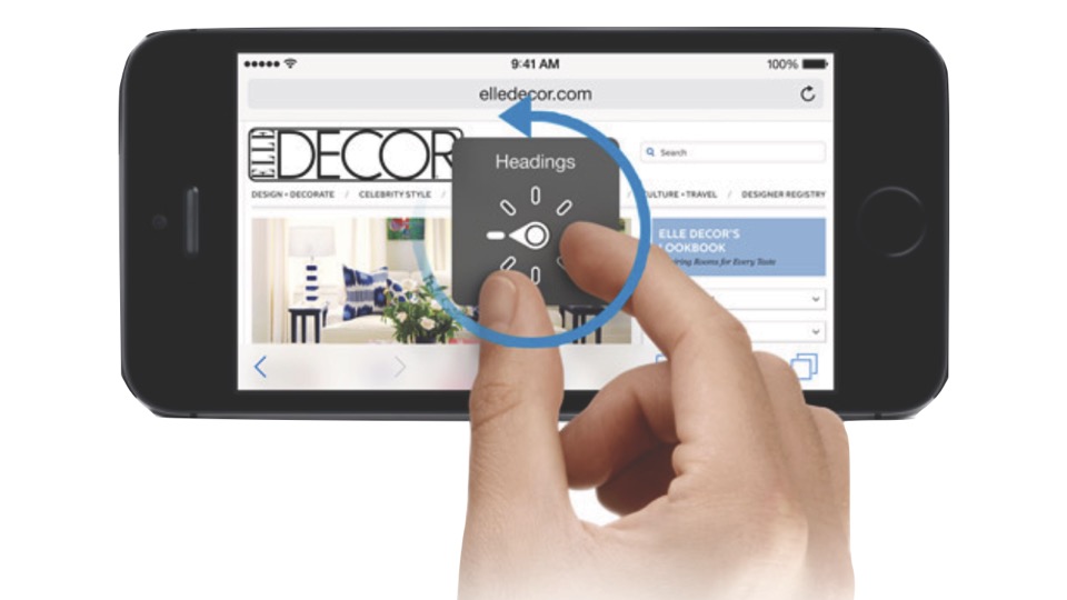
And we can go a long way towards that goal by using meaningful HTML markup to ensure an accessible experience from the start, such as using real focusable elements for buttons, and layering in ARIA attributes when necessary to improve the ways that markup is communicated to assistive technology.

And often most critically, it means applying enhancements defensively, in a qualified manner.
Features and constraints vary across browsers, devices, and networks, and the code we deliver should accommodate.
We need to take care to use techniques that shield users from downloading code that their device won’t end up using, or images that are larger than necessary for their display, and we must apply enhancements progressively, and cautiously, so that we don’t unintentionally break a page that was already usable in its initial delivered form.
But, often than not, I do find that the practices we use to achieve all of these goals tend to play very nicely together.
That’s really a testament to how well web standards have been planned. Carefully addressing one use case almost always betters the experience of the others as well.
That said, during the process of developing a site, one design requirement, optimization, or priority can sometimes complicate or conflict with another, or at least competes with the way we’re used to doing things. And when that happens, we ideally want to find new ways to satisfy all our priorities.
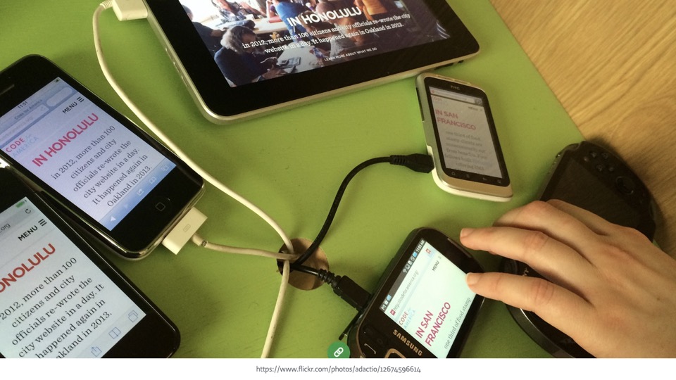
Recently, I’ve encountered some challenges at the intersection of responsive design and accessibility.
CSS itself gives us powerful control over the way our linear HTML is presented, and using it as designed can sometimes result in a disconnect between the markup that keyboard and assistive technology users interact with, and the way that markup is being presented on the screen. Additionally, CSS media queries enable us to shift between many of these potentially disconnected presentations of our HTML depending on the size of the viewport, which can compound the problem.

That disconnect can create barriers for many people.
More and more, we’re tasked with creating components that behave quite differently across devices. Inadequate pairing of visual & aural interfaces at all variations of a UI can lead to confusion, particularly for sighted (and partially sighted) screen reader users.
And that’s perhaps an under-looked group. Our field typically discusses screen reader usage as it relates to blind people, but it’s easy to forget that folks use screen readers and other assistive tech for a far wider variety of additional reasons, from partial sightedness to cognitive disabilities, to all kinds of physical impairment (temporary and not).
Much like all means of accessing the web, assistive technology is no single platform, but rather a continuum, to quote Jeremy Keith… a continuum of use cases to consider.
As most accessibility guides will say, pairing the visual experience very closely with the experience that is communicated to assistive technology can eliminate a great number of problems for users throughout that continuum.
But achieving that is not always straightforward.
For the rest of this session, I’ll look at some of the challenges I’ve seen in accurately communicating the changing state of a responsive interface to assistive technology.
A little while ago, I reached out on Twitter to ask about the challenges other developers encounter in creating accessible responsive layouts, and many of the answers related to problematic spatial and behavioral language in a UI.
I too had run into issues in this area.
Sometimes text cues in an interface reference the visual relationship of elements in a layout, and that text can be misleading if that layout changes across viewport sizes in a responsive design.
Take this somewhat contrived example of a text caption that might appear below or to the right of an image depending on the viewport size. Referring to the image using terms like “above” or “left" can be misleading unless we dynamically update it to match the layout, and that’s probably more complicated than it’s worth.
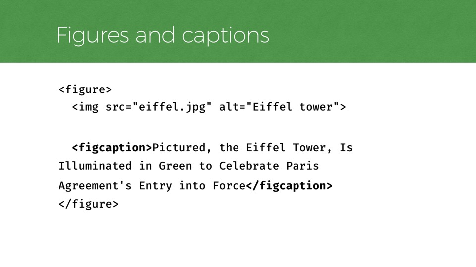
You could extrapolate this example to more complicated scenarios, particularly with info graphics. But if we try to avoid visual language entirely and instead say something like "Pictured: …” or “Figure 1”, we can avoid those spatial issues before they crop up.
Code example:
<figure>
<img src="eiffel.jpg" alt="Eiffel tower">
<figcaption>Pictured, the Eiffel Tower, Is Illuminated in Green to Celebrate Paris Agreement's Entry into Force</figcaption>
</figure>
For cases like this, it also improves accessibility to use HTML elements that are designed for this use case of relating a caption to a figure.
The figure and figcaption elements are designed for this, as shown here, and their native semantics leave nothing for us to add.
So a site’s language use can be overly tied to visual presentation. It’s also possible to use language that’s overly specific about how a site should be used. Text that attempts to aid usability for particular input types may be irrelevant or confusing to users with devices that lack that capability.
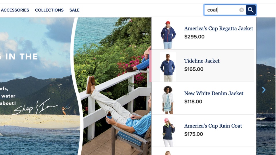
I recently encountered such an example when building an autosuggest search field. At first, I was inclined to include instructions on the field to aid in using the suggestions that it offers.
For example, a message like "use your arrow keys to browse the suggestions” could be applied using the aria-describedby attribute.
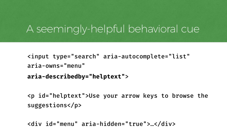
Code example:
    <input type="search" aria-autocomplete="list"
aria-owns="menu"
aria-describedby="helptext">
<p id="helptext">Use your arrow keys to browse the suggestions</p>
<div id="menu" aria-hidden="true">…</div>
The HTML for that might look like this:
A search input with ARIA attributes noting things such as that it will offer a list autocomplete, and that it is described by a paragraph of helper text referenced elsewhere in the page (which is the text that contains my helpful note about arrow key usage)
And admittedly, there would be more code involved in making this control really function. Such as a fair amount of javascript to toggle attributes and populate the menu options as the user types.
Still, with that HTML alone, we can already focus on the text input in desktop browser, with a screenreader enabled, and hear something like this.
(Audio clip: “search, edit text. Use your arrow keys to browse the suggestions.”)
To a developer like me, sitting at my work laptop, that might seem like a helpful addition. However, responsive designs need to be ready not only for many screen sizes but also different input mechanisms too, and it’s easy to forget that well-meaning instructions like these may not be helpful to folks browsing on a touchscreen for example, which often has no arrow keys to use.
For someone using this control on a touchscreen and a screen reader like VoiceOver, the instructions aren’t so helpful. To support that use case, we would want to make sure the menu options are usable via tab focus, as that will map nicely to VoiceOver’s screen gestures.
As we do more and more testing to support different modes of input like that, we increase the likelihood of the control being intuitive to use without many instructions, so we can shift the helper text to describe something less input specific. In my case, I ended up changing the text to say this:
(Audio clip: ”As you type, relevant search suggestions will automatically appear after this field.")

Another common practice is properly hiding content that should not be presented visually in a design, but that is beneficial to those using assistive tech.
Generally, I find it’s best to avoiding hiding content at all unless it improves the user experience to do so, but if you need to accessibly hide content, there are many things to keep in mind.
From a CSS standpoint, hiding HTML elements so that only screen readers can access them is both common and reliable.
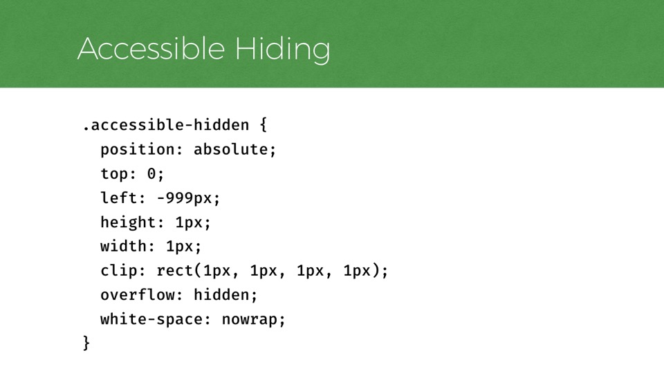
Code example:
      .accessible-hidden {
        position: absolute;
        top: 0;
        left: -999px;
        height: 1px;
        width: 1px;
        clip: rect(1px, 1px, 1px, 1px);
        overflow: hidden;
        white-space: nowrap;
      }
The way that’s typically done is to position an element outside of the visual viewport so that it’s not in the rendered view, using some styles like this. As long as styles like display: none and visibility hidden are avoided, the content can still be accessed by screen readers.
There’s a lot of history packed into this little bit of code. But the basic mechanics of it simply move the element offscreen and collapse its dimensions so that it’s not visible. The 1 pixel size became common because VoiceOver would ignore text with 0px dimensions. Rules like clip are there as extra safeguards for certain elements that don’t collapse to 1px without a fight. And -999px is generally enough to get an element well outside the left of the viewport, unless you’re building a right-to-left layout…
Code example:
      .accessible-hidden {
        position: absolute;
        top: 0;
        left: -999px;
        height: 1px;
        width: 1px;
        clip: rect(1px, 1px, 1px, 1px);
        overflow: hidden;
        white-space: nowrap;
      }
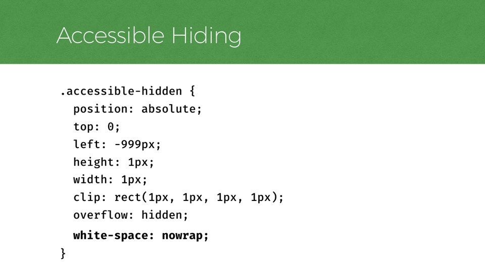
One part of this code that I find particularly interesting with regards to accessibility is the last rule.
I learned recently that when you collapse an element down to small dimensions like this, the text inside it will naturally wrap, and some screen readers may interpret those word wraps in unhelpful ways, such as ignoring them entirely so that sentences are read aloud without spaces!
To avoid that, you should include white-space: nowrap in your accessible-hidden styles, and the text doesn’t virtually wrap inside the 1px container, and the spaces will be retained.
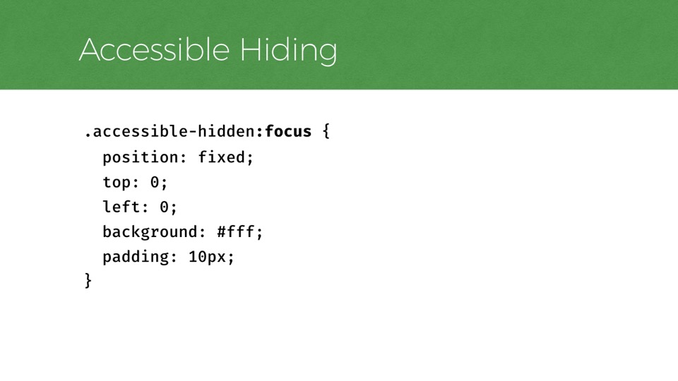
Code example:
  .accessible-hidden:focus {
    position: fixed;
    top: 0;
    left: 0;
    background: #fff;
    padding: 10px;
  }
Another thing that’s easy to forget is that hiding content accessibly will not prevent focusable content from receiving keyboard focus.
When the roving focus state seems to disappear while navigating the page because it ended up focusing on hidden content, it can be very disorienting.
To avoid this problem, I try to remember that any accessibly-hidden content should no longer be hidden when it gains focus. As one example, the CSS shown here will position an accessibly-hidden element element at the top of the viewport when focused
And that’s a common approach for styling skip links.
We use this CSS for the skip links on the interior pages of Filament’s site, all of which have a skip-to-content link that is hidden when not focused. If you’re tabbing through this page, it’ll be the first element that gains focus, shown top/center.
This is really helpful to all keyboard users, especially those who are sighted or partially sighted, perhaps using a screen reader as an aid on top of the visual interface. In those situations especially, the parity between visual and aural experience is really critical.
So in the rare cases where it makes sense to hide focusable content, this approach is a helpful way to ensure it doesn’t stay hidden when actually focused.
The ways CSS presentation can unintentionally impact accessibility are scary and fascinating to me.
That text hiding gotcha was one really good example of that.
Another one I have run into comes from the common technique of using CSS text-transform to change text letter case.
It’s common to see all-caps used for small buttons in an interface, and the “right” way to do this is to use ordinary sentence case text in the source code and use CSS to transform it to all-caps, and perhaps even only at certain viewport sizes.
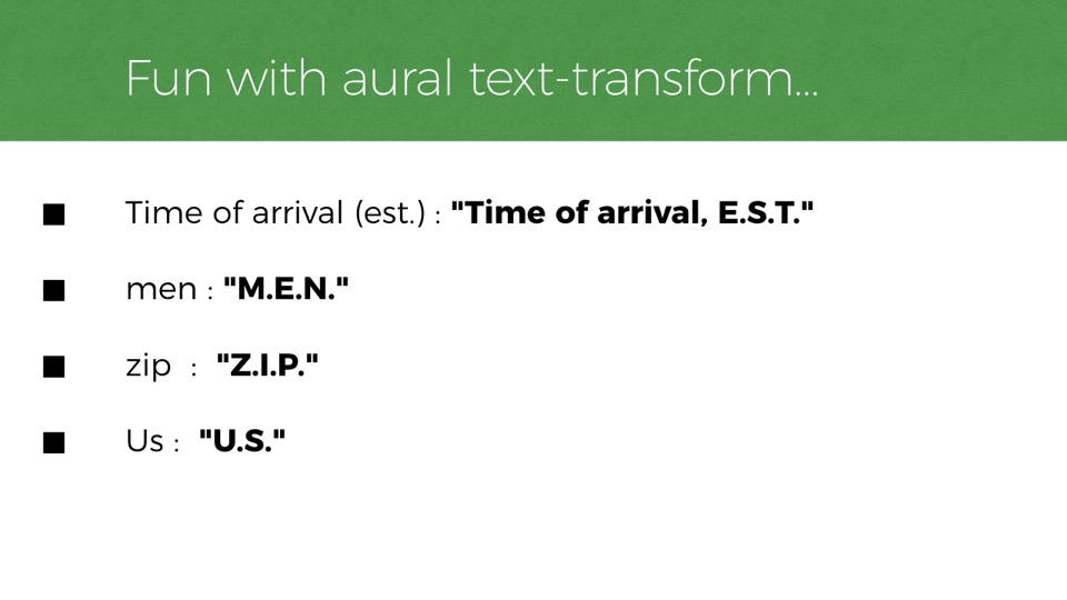
One thing you might not expect is that VoiceOver will sometimes speak an element differently depending on whether this CSS style is applied.
(Audio clip: “Add to Bag, A-D-D to Bag”)
Fun with aural text-transform
- Time of arrival (est.) : "Time of arrival, E.S.T."
- men : "M.E.N."
- zip : "Z.I.P."
- Us : "U.S."
So voiceover seems to assume that when some words are made all-caps, just with CSS, they become acronyms and it reads them one letter at a time. This could create some pretty confusing situations.
For example, an estimated time of arrival could become the time of arrival in the EST, the eastern time zone.
Or, perhaps a link to “Visit Us” would be read as “Visit U.S.”, which sounds like it’s suggesting you visit the United States. And that’s a very different thing.
Code example:
<button aria-label="Add to bag">Add to bag</button>
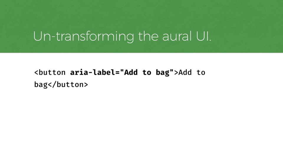
Thankfully if you run into this problem yourself, there is a workaround I’ve used that can fix it.
Aria-label will let you specify the text as you’d like it to be read. It’s not ideal, but it works, and we actually had to do use this in a recent project.
In theory, the CSS property “speak: normal” (as opposed to “speak: spell-out”) should fix this too, which would be better. But I was not able to get it to work in VoiceOver.

One of the most common challenges I find in building responsive layouts comes from accurately communicating the role and state of responsive toggles.
So much of UI design involves toggles, whether they’re accordions, menus that open and close, dialogs, tabs.
But toggles that are only sometimes user-interactive, depending on various conditions, can be particularly tricky to communicate well to assistive technology.
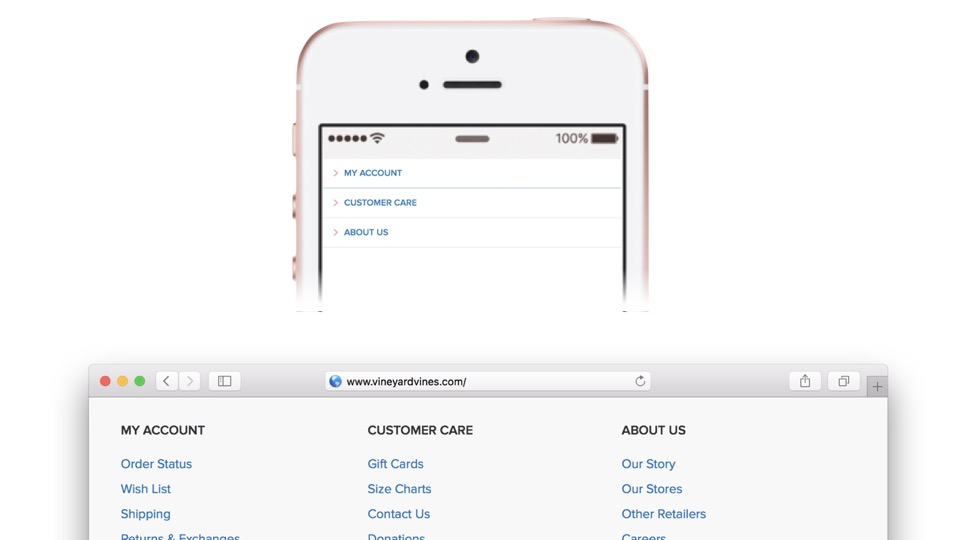
Consider a component like this one.
On small screens like the phone at the top, we have some navigation lists that are user-expandable, while on wider screens the list items are shown at all times, without any ability for the user to collapse them, and the buttons that formerly acted as toggles are instead just text headings above each list.
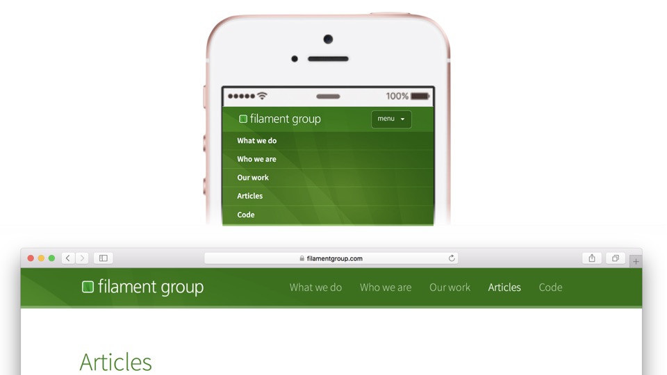
Here’s another example of this same sort of behavior, from the navigation on Filament’s website.
Again, here we have a list of navigation links, sometimes preceded by a button that lets you toggle their visibility, or sometimes displayed statically without any need for user interaction.
In these two examples, the components are different enough in behavior that they should be described differently to assistive technology.
I find it’s fairly easy to find examples online for creating either a variant of this component’s HTML in accessible ways. But managing both in the same UI is less often discussed.
As a result, developers like Dave Rupert here have admitted that they’re trying to show and hide content less often, just to avoid dealing with the complexity of doing it well…
HTML Starting Point
<h2 class="collapsible_header">Packing List</h2>
<div class="collapsible_content">
...
</div>
So how might we do it well?
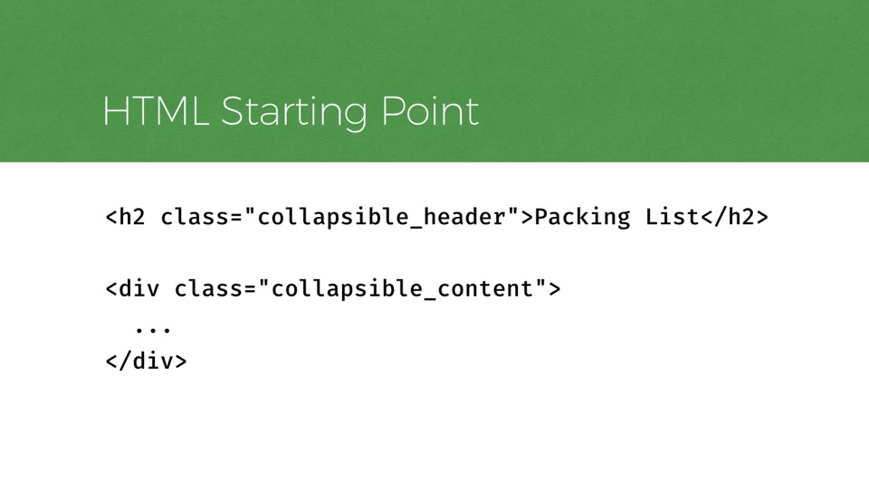
Well, here’s how that component might start out in the HTML source, before any JavaScript is applied to make it user-toggleable.
Pretty basic. There’s a level 2 heading, followed by a div containing some collapsible content, perhaps a list of links.
Now, to make that markup meaningful as a toggle control, it needs some additions.
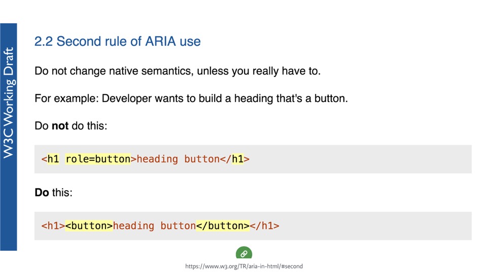
If you’re like me, your first inclination might be to use JavaScript to transform the role of that heading into a button, but the ARIA specification’s rule number 2 explicitly asks that we do not do that.
Instead, we should insert a button element into the heading, which allows that heading to stay in the document tree as handy accessible navigation.
I should note here that the ARIA spec has some fantastic documentation nowadays and this particular page has a short list of rules that are really great as high-level guides.
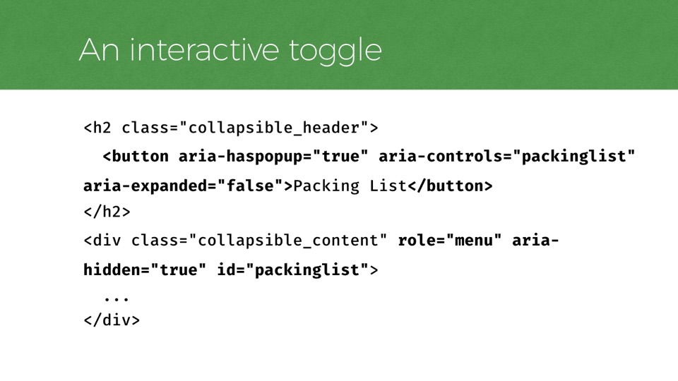
An Interactive Toggle
      <h2 class="collapsible_header">
        <button aria-haspopup="true" aria-controls="packinglist" aria-expanded="false">Packing List</button>
      </h2>
      <div class="collapsible_content" role="menu" aria-hidden="true" id="packinglist">
        ...
      </div>
So for a clickable toggle, the heading should have a focusable button element inside it.
There are also some ARIA attributes we can add to communicate the state (expanded or collapsed) and the relationship between the button and content.
Typically, we would add this markup with JavaScript, since the collapsible needs JavaScript to be functional.
But we also want to selectively add or remove this markup depending on the viewport size and which version of our component is in play.
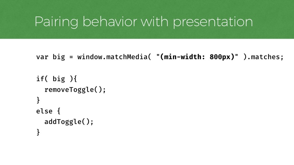
Pairing Behavior with Presentation
      var big = window.matchMedia( "(min-width: 800px)" ).matches;
      if( big ){
        removeToggle();
      }
      else {
        addToggle();
      }
And that part is tricky. Changing markup across responsive layouts is not as easy as changing presentation. We have to do it by adding or removing attributes and elements. And we need to figure out WHEN to do that as well.
One way we could figure that out is to use the matchMedia function, which lets us test media queries in JavaScript to see if they match or not.
We might check if a media query matches when the page loads, and listen for it to change at later times too…
And this would work, but it also adds some unfortunate maintenance overhead, as now we have presentation information in our JavaScript as well as our CSS.
A better way might be to write our script to inspect which CSS rules are active, and based on that, we can know which version of the component is being shown. Then we can update the HTML to best communicate that version.
To do this, I’ve used the CSS cursor property (which changes the mouse cursor) to denote whether the heading is supposed to act as a toggle at a particular breakpoint. For example, the cursor should display as a “pointer” when the toggle is interactive, and as the “default” arrow when it is not.
With the cursor property denoting the version of the component, my JavaScript could check this property and manipulate the HTML and behavior accordingly.
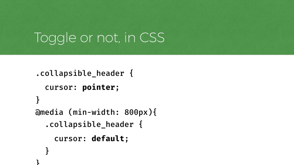
Toggle or not, in CSS
      .collapsible_header {
        cursor: pointer;
      }
      @media (min-width: 800px){
        .collapsible_header {
          cursor: default;
        }
      }
To recap that last bit, here is how that looks in CSS.
Our collapsible heading begins with a cursor of pointer. Then at 800px the cursor property changes to default, declaring the heading non-interactive.
JavaScript can read active CSS rules so it pick up on this and manipulate the markup accordingly, removing the ARIA attributes and button.
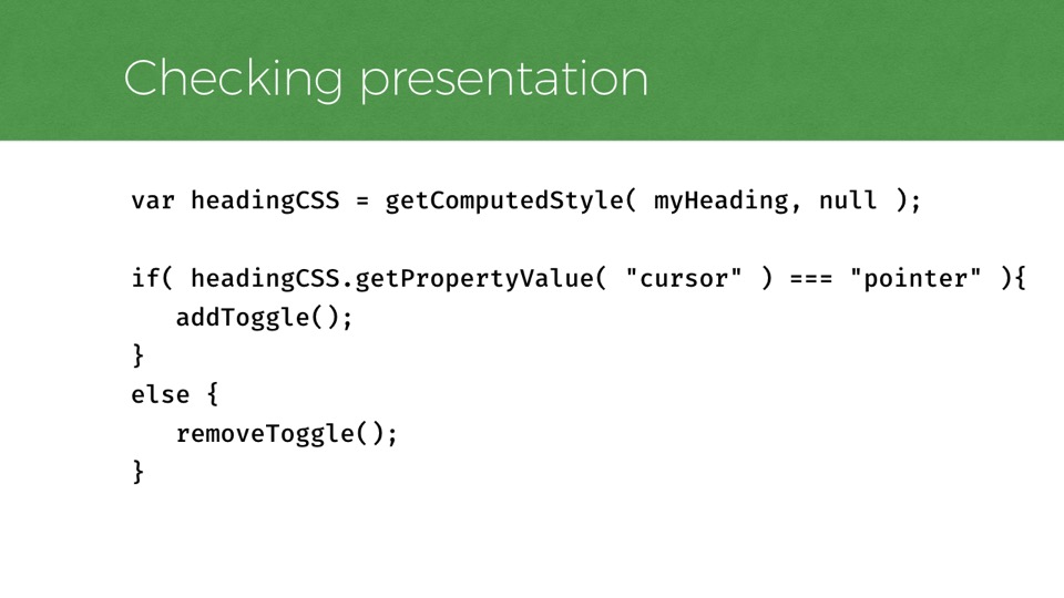
Checking Presentation
      var headingCSS = getComputedStyle( myHeading, null );
      if( headingCSS.getPropertyValue( "cursor" ) === "pointer" ){
         addToggle();
      }
      else {
         removeToggle();
      }
Here’s an example of some JavaScript that is checking the cursor CSS property.
Technically, the getComputedStyle method allows us to do this, so I’m using that to get the styles of myHeading, which represents my collapsible heading.
Based on whether the value is pointer, I can make decisions on modifying the markup to match the version of the component that is in play.
So this is a little better than the matchMedia version, because now I can have many responsive toggles using the same logic, and the JavaScript doesn’t need to know the breakpoints at which they change from toggles to static.
Here’s how this component sounds in VoiceOver, the built in Mac screen reader, at its various sizes.
First as a collapsible menu, then as a simple navigation list with no menu button
So we can see that it pairs well with the UI at both breakpoints.
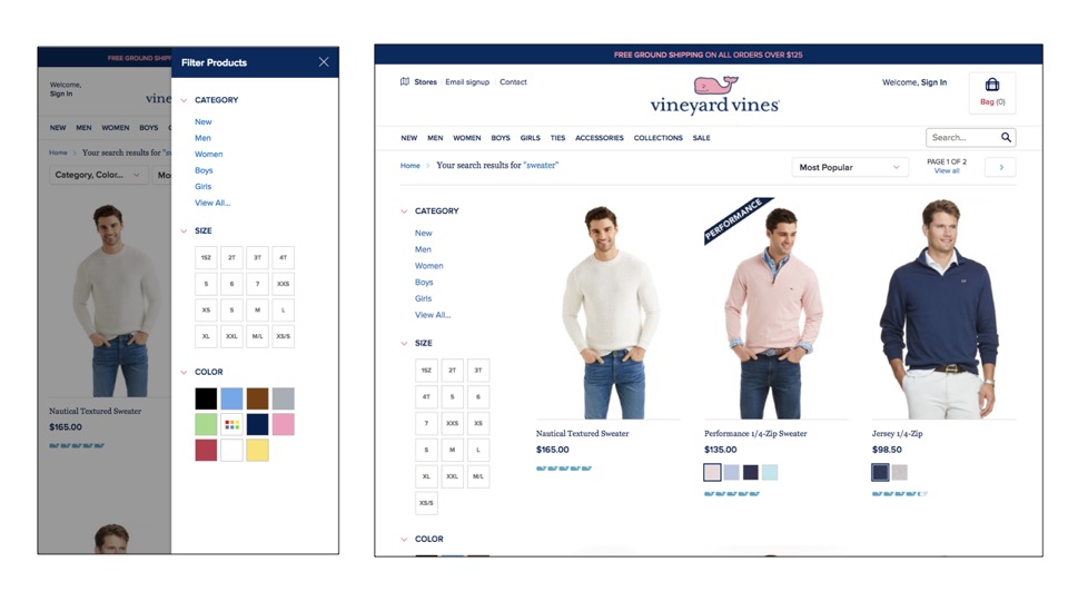
A similar challenge can occur with modal dialogs. Sometimes we use modals on small screens to toggle the display of content that is shown at all times on wider screen sizes.
Take for example, this Filters panel for a search results page.
On small screens, a user can open the filters in a modal dialog, and this is convenient because you don’t have to scroll back and forth on a small screen to refine your search.
On wider screens however, this content sits statically on the left side of the results, because there’s more room to display it.
Here’s a more generic version of a dialog control that does this same thing. This is an open dialog. And you can see its presentation change across breakpoints
Similarly to the collapsible toggle, these two states should be communicated differently in HTML.
Thankfully I found that we could use JavaScript to monitor and toggle the relevant attributes for the dialog, just like we did with the collapsible toggle.
With a dialog of course, the markup is a little different.
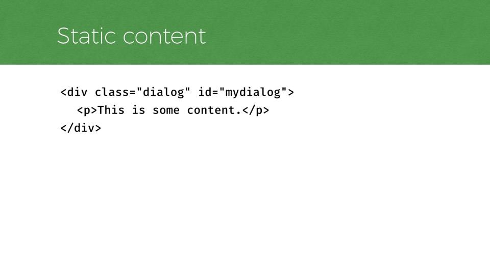
Static Content starting point...
  <div class="dialog" id="mydialog">
  	<p>This is some content.</p>
  </div>
The static, initial markup for potentially-modal content like this is nothing fancy.
Here’s a div with some content inside it.
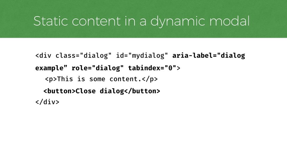
Static Content in a dynamic modal
      <div class="dialog" id="mydialog" aria-label="dialog example” role="dialog" tabindex="0">
    	<p>This is some content.</p>
      <button>Close dialog</button>
    </div>
However, when transformed into a functional dialog with JavaScript, that HTML should look more like this.
I’ve added a role of dialog, a tabindex attribute to allow focus, an aria-label attribute to describe the dialog, and a button to close the dialog.
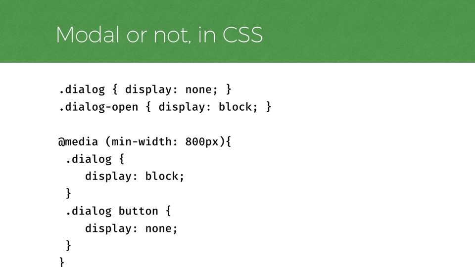
Modal or not, in CSS
      .dialog { display: none; }
  .dialog-open { display: block; }
  @media (min-width: 800px){
   .dialog {
      display: block;
   }
   .dialog button {
      display: none;
   }
  }
The CSS for toggling between the two versions of this component looks like this. We start by the dialog-open class is present.
At 800px, we shift the display property to block even when the open class is not present, making it visible at all times.
We also set the close button to display: none.
With this CSS in place, we can write JavaScript to pick up on the presentation and manipulate the markup, depending on the breakpoint. We’d want the script to check if the button is both display none AND the dialog is visible. If both of those are true, it’s a static dialog, and the script removes the modal-related attributes.
So, the approach of detecting CSS properties has worked for me in the past, but it still involves a degree of awareness of the CSS styles that drive each presentation.
Fortunately, there are some cleaner ways to communicate information from CSS to JavaScript that you might consider.
Mike Herchel’s article Importing CSS Breakpoints into JavaScript, from 2015, covers one such method.
Hacking the content property
      body:before {
      content: "smartphone";
      display: none; /* Prevent from displaying. */
    }
    @media (min-width: 800px) {
      body:before {
        content: "tablet";
      }
    }
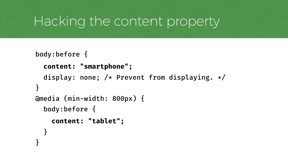
In the article, Mike uses CSS generated content, otherwise known as the :before or :after selector, which is a CSS selector that inserts a text element into the page.
And he sets the content property of that generated element to different values, which JavaScript can read and use in its logic.
He uses terms like smartphone, tablet, but we could replace that for something more component-minded like collapsed or expanded, or modal or static.
Neat. The downside to it is minor, but worth noting: generated content is not designed for this purpose, so it’s a bit of a hack. Be sure to use display none so it doesn’t appear in the design.
In Michael Scarnagl’s article, “Handling states on resize using CSS custom properties,” I found a cleaner and more forward looking approach.
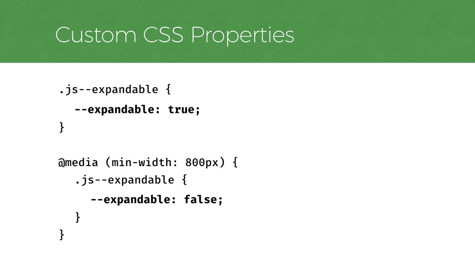
In it, Michael describes how to use CSS custom properties to communicate state to JavaScript.
Custom CSS Properties, instead
      .js--expandable {
      	--expandable: true;
      }
      @media (min-width: 800px) {
      	.js--expandable {
      		--expandable: false;
      	}
      }
Is anyone here using CSS custom properties yet?
Well, if custom properties are new to you, well, they honestly were to me too. They’re a pretty new standard that don’t yet enjoy full modern browser support.
But Michael’s concept here is neat.
He’s using a custom property “—expandable”, which JavaScript can detect like any other CSS property.
Best of all, custom properties have no native presentation to worry about, so they can be used without worry of interference in the UI.

The last issue I wanted to discuss is one I that think still has no great solutions, yet it is going to become more and more of a problem for users across the continuum of use cases
This issue is not even new. In fact it predates responsive design, though responsive design can compound the problem for certain.
It arrises when we use CSS to reorder the display of content so that it no longer follows the order in the page source.
With CSS, it’s trivial to do this, and most complex layouts, responsive or not, end up moving portions of HTML out of their natural source order at least in small amounts.
For example, just float some focusable elements to the right and you’ve done it: tab order will start on the right, then move left, opposite of display. Screen readers tend to follow source order in this way too, so elements would be read content from right to left in that case.
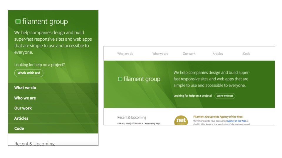
Here’s a vertical example from Filament’s homepage. Sighted users on small screens see our logo & description first. Yet wider screens get our navigation first.
In both, the HTML is the same, but the small screen layout follows source order. Meaning that the large screen experience has a disconnect between keyboard navigation and display. And yet, from a design perspective, we feel each presentation suits its context quite well.
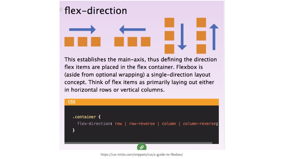
I expect this problem to get worse in the near future, as new CSS features like Flexbox & Grid have now landed in most browsers and make it even easier to depart from source order to achieve complex layouts.
Take flex box’s flex-direction: row-reverse value, which will flip the order of child elements from left to right to right to left. You can do the same vertically with column-reverse.
This makes for a dramatic departure between HTML and how it’s presented on the screen.
But is this not also the promise of CSS? Freeing layout from the constraints of source order is what drove web standards adoption away from table layouts. It’s hard to say we should not use CSS for what it’s designed to do.
Some folks think that browsers should step up to address this issue, perhaps by forcing tab and reading order to follow the visual display.
In my mind, that would be preferable to asking developers to either try to number elements tab index attributes manually, or worse, asking them to not use new CSS layout features.
Leonie Watson has written about this and thinks vendors need to address it. Indeed, as she notes, Firefox formerly had a bug in its Flexbox implementation that made tab focus follow visual order. They’ve since fixed it, but as she notes, maybe it was a good idea.
I think it would be great if browsers addressed this too, but I’ll admit it’s not without nuance.
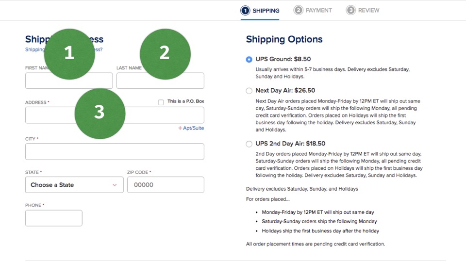
For example, in a form layout like this one, it make sense to navigate from the first two inputs to the fields beneath them.
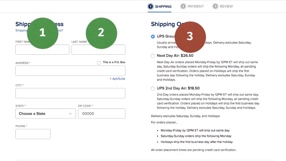
But a strict and not-very-smart calculated left-to-right focus order might end up roving focus to the next field on the right, which would not follow the expected logical order of the form.
Alternatively, there are surely many examples like this where you would want focus to rove to elements that are positioned in a particular visual spot, yet are greatly separated in source order, so it goes both ways.
Perhaps fieldsets and other semantic markup can aid the browser in making these decisions, but I’m not sure. It’s a complicated problem.
Thankfully it is being worked out as we speak, and hopefully we’ll see some improvements soon from browser vendors.
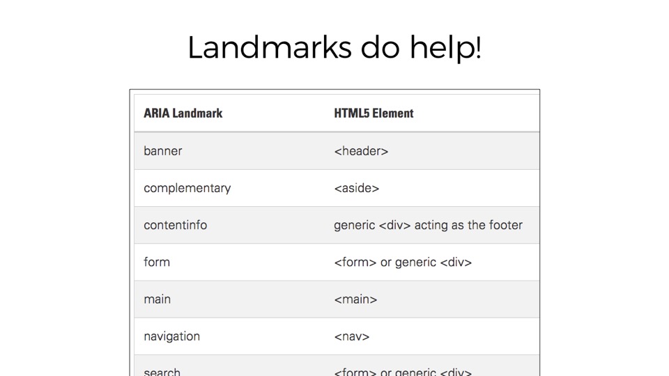
For now, at the very least, we should be using landmark roles or HTML 5 elements to communicate broad structural landmarks in our UI.
Landmark roles like header, main, nav, and contentinfo help a great deal when navigating a document with assistive technology, regardless of presentation, so keep using them to mitigate source order issues.
So I’ve covered a lot about complications at the intersection of responsive design and accessibility.
There’s much, much more to think about here, and I hope to see more discussion in this area as folks continue to improve the accessibility of their responsive sites.
We need to remember that we can build beautiful,complex sites that are broadly accessible.
Its harder to do that. It’s harder to deliver responsibly, and resiliently.
But… it’s important, and it’s one of the most satisfying parts of our job.