Tablesaw - A Flexible Tool for Responsive Tables
Posted by Mat, Zach on 08/06/2014
Next to coming up with project names, managing tables in a responsive layout is one of the trickiest problems in web development. Semantically structured tables are notoriously difficult to style as anything other than… well… a table. On the other hand, cobbling together a pile of divs and spans into a table-like shape means giving up the semantic meaning, accessibility, and navigability of real table elements to represent tabular data, or it means jumping through hoops to recreate those features. When it comes down to it, the semantic benefits of real table elements make them our first and best choice.
Our earliest approaches to the problem usually came down to one of two methods: either reflowing the table contents into a single column, or hiding columns behind a toggle navigation menu that allowed users to selectively turn data visibility on and off. These worked well enough, but more often than not we’d find that a single pattern wouldn’t get us very far. Hiding lower-priority columns behind a toggle may be the best approach for data sets that require direct comparison across rows and columns, while reflowing the content may only be appropriate in situations where each row’s data set can stand largely on its own—and the best approach can change depending on how much space we have to work with in a given layout. We’d often find ourselves building several “responsive table” plugins for a single project.
Knowing that a single project might benefit from different approaches, we’ve been working on a group of jQuery plugins (headed up by Zach Leatherman) that allows us to mix-and-match approaches, and provides a number of options for “navigating” through a table at smaller breakpoints.
Tablesaw: A Script You Can Sink Your Teeth Into
Permalink to 'Tablesaw: A Script You Can Sink Your Teeth Into'Following lots of early experiments with responsive tables, we came to the conclustion that any approach to “responsive tables” needs to address a few key points:
- first and foremost, it needs to flexibly reformat table layouts in a way that’s suitable for compact screens, without removing any data outright from the markup
- If any data are hidden by default, it should provide some method to let users to access that information (we can’t make assumptions about what data will be relevant based on the screen size)
Tablesaw lets developers apply rules to determine display presentation layout, data priority, and adds a range of extensions to give users control over data display and interaction.
Stack
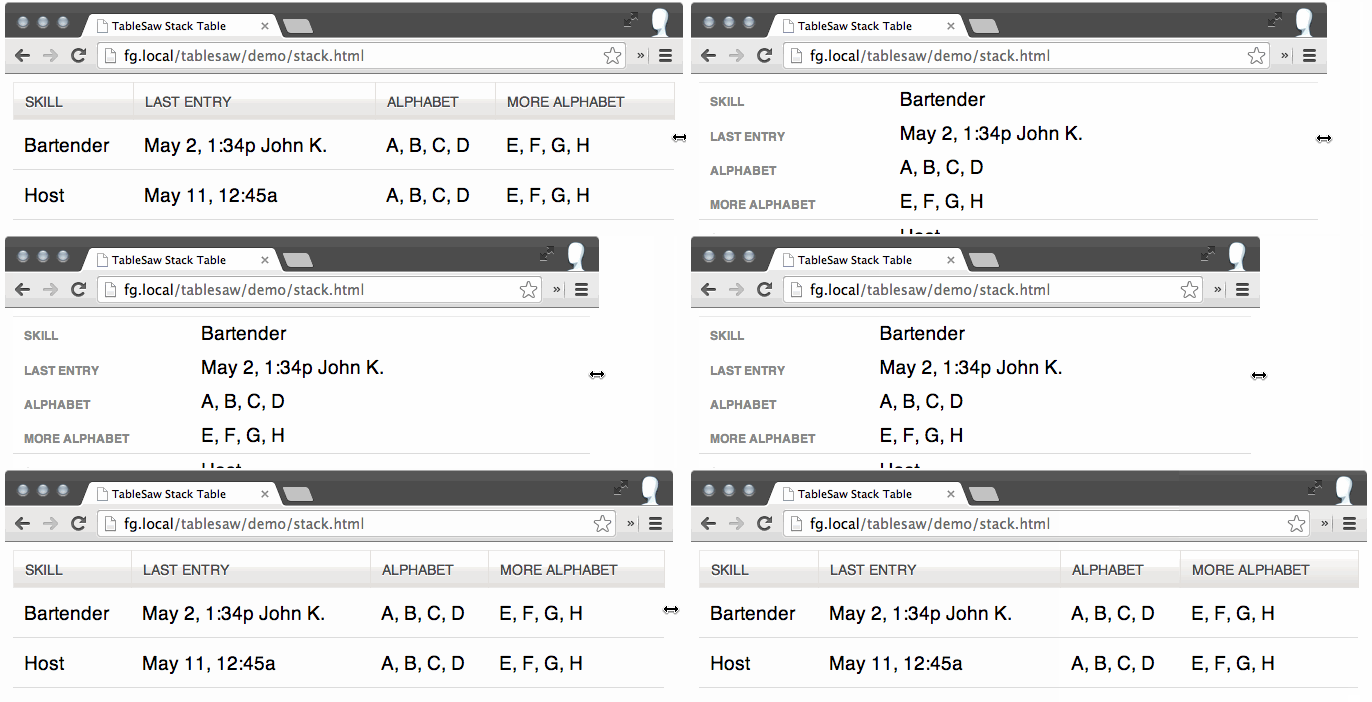
Permalink to 'Stack'The stack option is the most basic approach to reformatting a table for small layouts, stacking the table contents and duplicating the table headers to make a list of key/value pairs. (View the Stack table demo )

Toggle
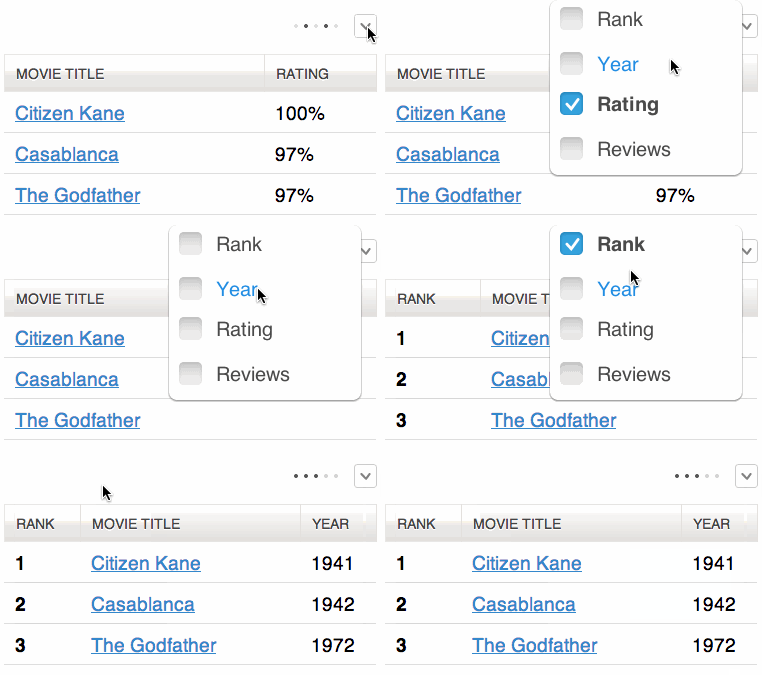
Permalink to 'Toggle'The columntoggle option will hide columns at smaller breakpoints, injecting a small navigation link that allows the user to show/hide columns as-needed. (View the Toggle Table demo)

We can’t make sweeping assumptions about what data our users will want to see, but we can make a few guesses at which columns are more likely to be critical. So, rather than hiding the table columns indiscriminately at small breakpoints, we’ve added the ability to flag columns as persistent, and as toggle-able at a range of viewport sizes.
<th data-priority="persist"><!-- Not eligible for toggle, always shows --></th>
<th data-priority="1"><!-- Shows at (min-width: 20em) (320px) --></th>
<th data-priority="2"><!-- Shows at (min-width: 30em) (480px) --></th>
<th data-priority="3"><!-- Shows at (min-width: 40em) (640px) --></th>
<th data-priority="4"><!-- Shows at (min-width: 50em) (800px) --></th>
<th data-priority="5"><!-- Shows at (min-width: 60em) (960px) --></th>
<th data-priority="6"><!-- Shows at (min-width: 70em) (1120px) --></th>
Page/Swipe
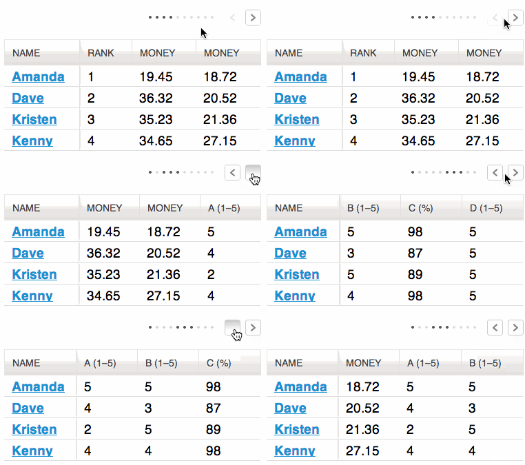
Permalink to 'Page/Swipe'Swipe tables provide two methods for “paged” navigation through a table, one column at a time. It provides the user with a set of next/prev controls and the ability to swipe left or right over the table itself, on devices that support standard touch events. (View the Page/Swipe demo)

Mode Switcher
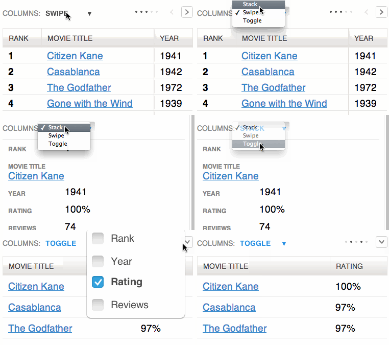
Permalink to 'Mode Switcher'The “mode switcher” option allows the user to toggle between the “swipe,” “toggle,” and “stack” methods described above. (View the Mode Switcher demo)

Sortable
Permalink to 'Sortable'The “sortable” option allows the user to sort the the table data by clicking on the table headers. Since all the columns may not be visible on smaller breakpoints (or not there at all if using the “stack” table mode), relying solely on the column headers to choose the table sort isn’t practical. To address this, there is an optional data-sortable-switch attribute on the table that adds a select menu auto-populated with the names of each column in the table with options for choosing ascending or descending sort direction. Data options on table headers can be used to control which columns are sortable and the default sort order. (View the Sortable Table demo)
Minimaps
Permalink to 'Minimaps'Both the “swipe” and “toggle” methods involve hiding data from the user at times. Without some kind of visual indication that more data is available, it can look like those columns are just missing altogether. So, both swipe and toggle allow for the addition of a “minimap” that shows which columns are visible at any given time. You’ll see this in the screenshots above, as a set of dots.
Customizable Breakpoints with SCSS
Permalink to 'Customizable Breakpoints with SCSS'We’ve included a SCSS mixin that allows you to easily customize the breakpoint below which Tablesaw’s methods kick in. First, include the tablesaw.stackonly.scss file instead of tablesaw.stackonly.css in your SASS. Then, you’ll want to scope the mixin to the the parent of the table element. So, assuming the following markup:
<div class="parent-element">
    <table class="tablesaw" data-mode="stack">
        […]
You’ll want to include the mixin like so:
.parent-element {
  @include tablesaw-stack( 50em );
}
I came, I sawed, I conquered
Permalink to 'I came, I sawed, I conquered'We’ve found that the patterns included in Tablesaw, with a little CSS tweaking, have been enough to cover all our tabular data needs across a huge range of projects. We hope Tablesaw is something you’ll find useful in your day-to-day work, and that it inspires you to come up with new patterns of your own—we’d love to hear about them.
Acknowledgements
Permalink to 'Acknowledgements'This post and library would not have been possible without prior Filament Group work on Responsive Tables, as well as jQuery Mobile work on Stack and Column Toggle tables. Also, we must not forget the ubiquitous Chris Coyier and his CSS Tricks post on Responsive Data Tables.